The colors we pick for our home fabrics—like curtains, cushions, rugs, or upholstery—are very important. They help set the mood and feel of our living spaces. In Australia, interior design trends often show the landscape’s natural beauty. Knowing about color psychology can help homeowners make their spaces inviting and balanced.
This blog looks at how colors affect mood. It also discusses which fabrics go well with certain colors. You will learn how to use color psychology to improve your home’s look and feel.
Understanding Color Psychology in Interior Design
Color psychology examines how different shades affect human emotions, behaviours, and perceptions. In home interiors, the right color choices can:
- Boost relaxation in bedrooms
- Energise living areas
- Improve focus in home offices
- Create warmth in communal spaces
Australians often like homes that are open and filled with light. These homes connect with nature. Choosing the right fabric colors can improve these design ideas.
How Different Colors Affect Mood in Home Fabrics
1. Calming Blues & Soft Greens
Best for: Bedrooms, bathrooms, relaxation zones
Fabrics: Linen, cotton, velvet
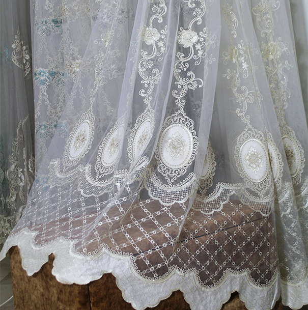
Shades of blue and green evoke tranquillity, making them ideal for spaces meant for relaxation. Soft blues (like sky blue or powder blue) mimic the ocean and sky, which are deeply connected to Australia’s coastal lifestyle. Greens, especially sage or eucalyptus tones, bring the outdoors inside, promoting a sense of balance.
Australian Design Tip: Use blue or green fabrics with natural textures. Try jute rugs or wooden furniture for a coastal or bushland look.
2. Energising Yellows & Oranges
Best for: Living rooms, kitchens, entryways
Fabrics: Cotton blends, woven fabrics, polyester
Warm tones like mustard yellow, terracotta, and burnt orange add vibrancy to social spaces. These colors stimulate conversation and energy, making them great for Australian open-plan living areas.
Australian Design Tip: Use ochre or earthy orange colors in cushions or throws. This will reflect the Australian outback. Keep the walls neutral for balance.
3. Neutral & Earthy Tones (Beige, Taupe, Grey)
Best for: Any room, minimalist or Scandinavian-style interiors
Fabrics: Wool, linen, bouclé
Neutral colors create a timeless, sophisticated backdrop. In Australia, earthy colors like sand, taupe, and beige (grey-beige) are popular. They go well with natural light and outdoor views.
Australian Design Tip: Use different textures to add depth to neutral rooms. For example, place a chunky knit throw over a linen sofa.
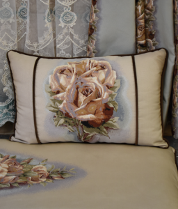
4. Passionate Reds & Pinks
Best for: Accent pieces, dining rooms, creative spaces
Fabrics: Velvet, silk, microfiber
Red stimulates appetite and conversation, making it a great choice for dining areas. Dusty pink or blush tones add a soft, modern touch to bedrooms or lounges.
Australian Design Tip: Use red in moderation—opt for terracotta cushions or a bold rug rather than overwhelming walls.
5. Sophisticated Blacks & Deep Charcoals
Best for: Modern interiors, statement furniture, luxury accents
Fabrics: Leather, suede, heavy cotton
Dark shades add drama and elegance. In Australian homes, black fabrics work well in monochromatic schemes or as a contrast against white walls.
Australian Design Tip: Balance black fabrics with indoor plants or light wood tones to prevent spaces from feeling too heavy.
Choosing the Right Fabrics for Your Color Scheme
Beyond color, the fabric material also impacts mood:
- Linen & Cotton: Breathable, relaxed vibe (perfect for coastal homes)
- Velvet: Luxurious, cosy feel (great for winter interiors)
- Wool & Bouclé: Textured, warm (ideal for minimalist yet inviting spaces)
- Silk & Satin: Elegant, reflective (adds glamour to bedrooms)
Applying Color Psychology in Australian Homes
1. Coastal & Hamptons Style
- Colors: Whites, blues, soft greens
- Fabrics: Light linen, cotton, sheer curtains
- Mood: Airy, fresh, relaxed
2. Outback & Earthy Tones
- Colors: Terracotta, ochre, deep greens
- Fabrics: Woven textiles, leather, wool
- Mood: Warm, grounded, rustic
3. Modern Minimalist
- Colors: Neutrals, black accents
- Fabrics: Smooth cotton, bouclé, faux fur
- Mood: Clean, sophisticated, serene
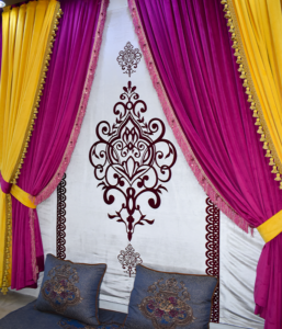
4. Bohemian & Eclectic
- Colors: Jewel tones, warm pinks, mustard
- Fabrics: Mixed textures (velvet, macramé, silk)
- Mood: Vibrant, creative, cosy
Final Tips for Using Color Psychology in Home Fabrics
- Think About Natural Light: Australian homes receive a lot of sunlight. Cool colors balance warmth, and warm colors make darker rooms feel cozy.
- Layer Colors & Textures: Combine different fabrics (e.g., a wool rug with linen curtains) for depth.
- Match Colors to Room Purpose: Calm hues for bedrooms, energising tones for living areas.
- Stay True to Your Style: Whether you love coastal neutrals or bold bohemian shades, choose colors that resonate with you.
Conclusion
Color psychology is a powerful tool in interior design, especially when applied to home fabrics. Choosing the right colors and materials allows you to make a space that looks nice and feels balanced. In Australia, design often takes inspiration from nature. Using colors from the ocean, desert, and bushland can make your home feel like a real sanctuary.
Ready to refresh your interiors? Start with small changes—new cushions, a statement rug, or fresh curtains—and notice how color transforms your mood and space!